Durham Delivers UX Redesign
Redesigning and extending a bulk meal delivery website that supports local restaurants
UX research & design • brand systems • web accessibility
Introduction
Durham Delivers was created in the early days of the COVID-19 lockdown to help Durham restaurants get their food to customers when their dining rooms were shuttered by local government mandates. By grouping online orders at one location and time while eliminating hefty service fees levied by popular delivery apps, Durham Delivers provided a financially viable bulk delivery model for independent restaurants and created new community-based delivery experiences for customers.
The Problem
Durham Delivers’ main objective was to maximize revenue to local restaurants by cutting out third-party delivery apps and their associated fees by offering pre-scheduled bulk meal deliveries to partner communities that nearby customers could participate in. We had partnered with a local product development firm to build the platform's beta version, which had been a great minimum viable product to get in front of users. However, this initial release had several usability issues that made it difficult for customers to evaluate delivery opportunities and complete their orders, and it also had technological constraints that limited the program’s ability to scale.
The Challenge
Identify the usability and performance issues with the current product and design a launch-ready product that can help users more easily meet their goals of supporting Durham restaurants and assist the program managers in scaling the program to the community more efficiently.
The beta version of the Durham Delivers platform prior to redesign and launch. Click to enlarge.
The People
Our users
We identified 3 distinct categories of users with varying skillsets and levels of internal access:
General users who use the platform to order meals and support local restaurants
‘Community Captains’ who both order meals from the platform but also message out to general users within their community
Our Program Managers who also use the CMS side of the platform to add new restaurants, communities, and meal event opportunities.
Our stakeholders
Our primary stakeholders included collaborators within the organization:
Our Program Managers — both admin users of the CMS and key stakeholders driving the overall strategy and outreach of the program powering the platform
Upstream from them were stakeholders within the community that we were accountable to:
Local restaurants and business owners participating in the program
Potential public and private sponsors
My Role
UX designer, brand strategist, front-end developer
Software/Technology Used
Figma, Conceptboard, Webflow, CSS, Javascript
Timeframe
5 weeks for both design and development
The Design Process
For this project, I relied on a double diamond design approach to quickly communicate with stakeholders, and for its flexibility in a process that was evolving throughout the product life cycle.
My double diamond design approach, annotated with the various design artifacts I created throughout the process.
Discovery
Initial Research - Stakeholder Interviews, Heuristic Review, and User Studies
To begin my research process, I interviewed the Program Managers, who were the main stakeholders in the project. They had a wealth of information about both user issues they were aware of from their extensive contact with beta program participants. They also had a lengthy list of their pain points with the current system and context about the greater business goals they hoped a design-thinking intervention could help them get to.
After gathering my notes from the primary stakeholders, I also conducted a heuristic review of the beta version of the site. Through this process, I noted several usability issues stemming from poor information hierarchy, an abundance of noise, and unpredictable performance that would all present challenges to scaling the platform to a broader user base.
Finally, I spoke with different users (some past participants of the program, others uninitiated users that I recruited) while having them interact and perform some basic tasks on the beta version of the site while narrating their thought processes. Through this, I uncovered different goals and motivations that users had in mind while interacting with the platform, as well as several challenges and frustrations they faced while trying to achieve their desired results, and many of these issues were exacerbated when users tried to interact with the platform on their mobile devices.
I aggregated all of these notes onto an annotated snapshot of the beta site, and I would return to this resource later to develop my archetypes and user stories.
Beta version of the platform annotated with research notes. Click to enlarge.
Growth Goals
Deliveries
6 weekly deliveries average during program beta
20 weekly deliveries goal
Revenue
$25,000 approximate total revenue driven to restaurants during beta
$150,000+ additional revenue goal for spring
Technology
Anecdotally most users seem to currently use their computers to visit the site and place order
Majority would prefer a more mobile-friendly experience
Definition
Our 6 behavioral archetypes. Click to enlarge.
Behavioral Archetypes
The different users I studied and knew of from my stakeholder interviews fell into a handful of groups with similar backgrounds and approaches when interacting with the site. I shaped these clusters of user feedback into behavioral archetypes with different goals and attributes. I revisited these archetypes throughout the design process to stay true to our users’ needs.
User Stories & Product Feature Queue
After developing the behavioral archetypes, I wrote a series of user stories highlighting the different functional goals each archetype would seek to accomplish with our product. This helped me outline a list of features to design and develop while keeping the focus on how each feature should solve a user’s problems. Additionally, I drew upon these user stories to prioritize the feature set and as a communication tool for outlining important milestones with our stakeholders during the design process.
A spreadsheet view of our user stories and feature queue. Click to enlarge.
Development
Brainstorming through exhaustive sketching of different approaches. Click to enlarge.
Brainstorming
There were many possible ways to meet the needs of the user stories before arriving at the feature queue outlined above. To explore the full set of solutions, I did several rounds of brainstorming to get as many ideas out onto paper and gradually refine them. Because I was responsible for both designing and building the new platform, many of these ideas ended up on the cutting room floor because of my limitations as a developer; however, having the space to explore these less feasible designs without fear sparked the inspiration for what became the final set of features in my queue. These brainstorm sketches also gave me the latitude to play with different approaches to composing and arranging various interactive elements before going to the wireframing stage.
Wireframes
After brainstorming what some of these user solutions might look like, I began sketching out low-fidelity wireframes to distill these disparate ideas into more specific screens and steps along the user journey. These wireframes were also the perfect tool to secure buy-in from project stakeholders before going into prototyping.
A spreadsheet view of our user stories and feature queue. Click to enlarge.
Our 4 part content model. Click to enlarge.
Content Model
From our stakeholder interviews, I knew that one of our greatest weaknesses included our Program Managers' difficulty in updating and maintaining content on the product's beta version. I also knew our greatest opportunity lay in supporting this team to drive greater impact in growing the program by reducing the inefficiencies and red tape they encountered when working with the current system – particularly if we were to reach our goal of 20 weekly bulk deliveries. Therefore, migrating Durham Delivers to a lightweight, flexible CMS was our highest priority feature in the queue.
As a first step, I drafted a new content model with all possible components we would want to incorporate to satisfy the gamut of user stories. I then worked with our Program Managers to revise and finalize the model in a way that was understandable, usable, and empowering to everyone involved before I built the full CMS structure in Webflow.
Information Architecture
In tandem with building the CMS structure, I also mapped out a high-level information architecture for the site that mapped to the unique journeys different users would take based on what archetype they conformed to and what context they came to the platform through (e.g., Did the come to the homepage via searching for “Durham meal delivery?” Were they directed to a community landing page via an email from their local Community Captain?). Thinking through these different entry points, user goals, and journeys helped me tailor different parts of the platform to serve these different needs.
An extended sitemap designed to follow our users’ intended journeys. Click to enlarge.
Screenshots of building the functional prototype in Webflow. Click to enlarge.
Functional Prototype & Development
Because I was using Webflow as the design and development platform, I could go directly from lower fidelity wireframes (combined with the content model and information architecture) into building a functional prototype that would be refined over time into a launch-ready product. Some of the advantages of this process included working with live data and content from our Program Managers so that I could see in real-time how they were using the CMS. This insight allowed me to shape the design to best facilitate their goals while also testing both the overall front-facing design and the content with our end-users.
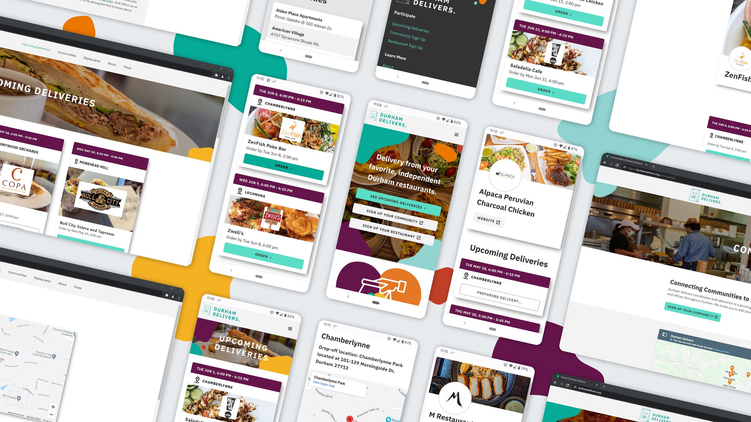
Delivery
Mobile-First Bulk Delivery Discovery Platform
Through multiple rounds of design, I fleshed out several pages across the platform that catered to the spectrum of user journeys. Take a look at the different flows below.

User flow for placing selecting a bulk delivery event via upcoming deliveries.

User flow for placing selecting a bulk delivery event via the users' community.

User flow for placing selecting a bulk delivery event via users' restaurant of choice.
Design Principles & Tactics
Empathetic Design & Delight
As I tested the functional prototype with stakeholders and users, some (particularly our on-demand diner archetypes) highlighted the great friction and poor continuity they experienced after finding a delivery event they were interested in and then being referred to a third-party site to complete their order. Because of project constraints, we could not implement the ideal solution of an API integration with different third-party platforms that would provide that continuity – so instead, I developed solutions that would empathize with the friction the user was experiencing and celebrate their participation in the platform.
The first element I incorporated was more copy that empathized with the user and where they were at that point in the journey and acknowledged the friction they would face (but posed it as worthwhile).
I also incorporated animations to celebrate users who took the step of committing to placing an order. I collaborated with a graphic designer on our team to produce 10 unique shooting star elements that would fly across the screen after a user pressed the “Let’s Order” button – a positive incentive to propel users on their journey and also recognize them for how they are supporting local businesses, not just placing an everyday meal order.

Examples of the celebratory animations.
Designing for Empty States
The platform's new design had many more pages catered to specific communities and restaurants. Not all of these specific pages would always have upcoming deliveries; however, they might still be go-to entry points for many of our users. As an extension of my priority for empathetic design, I created content for these empty states that still gave users tangible actions to take until their next time using the platform.
Example of an empty state on a Community listing page. Click to enlarge.
Information Hierarchy
A single delivery event contains several pieces of data a user must process before deciding that delivery is the one they want to choose and place an order with. My initial user research of the platform's beta version revealed that users were overwhelmed by the amount of information to sift through and confused by how the information was organized. It was paramount to establish a clear information hierarchy and only surface the information that was needed for users to make an initial decision to order from a participating restaurant.
First, I wanted to learn more about what information was of greatest value to users when making their ordering decisions. I sat down with multiple users and had them perform the task of finding a suitable delivery event near them to order from off the site's beta version. While doing this, I had them talk me through their thought process. They tended to scan the list of events by date, hone in on communities that sounded familiar or knew were nearby, and then look at the restaurant to see if it was one they were interested in.
Based on this mental model for decision-making, I drafted an information model for the new event cards that positioned and emphasized the information based on how our users prioritized it in their scanning of options. I also decided to use progressive disclosure and hide the instructions on a second screen that could be accessed once the users committed to a particular delivery event – thus cutting down on the information overload.
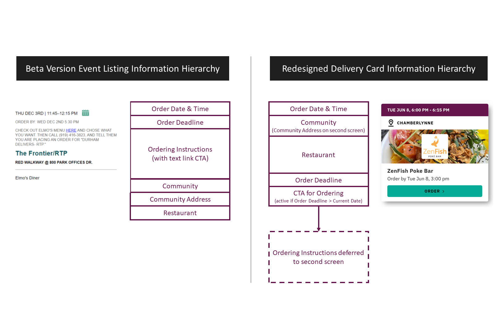
Comparison of the beta version's information hierarchy vs. the revised information hierarchy for the redesigned event cards.
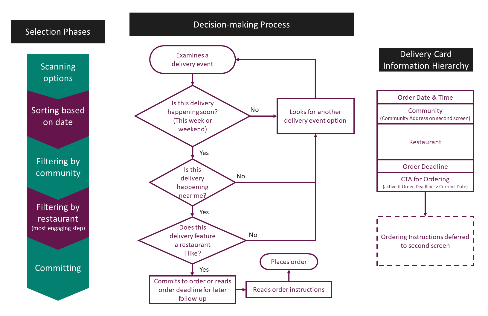
Diagrams of the user decision-making process and corresponding information hierarchy I implemented.
Contextual Design Patterns
The delivery event card became the main unit of information across the platform but needed to disclose different kinds of information depending on what page it was shown. For example, the default version of the event card would show the logo and photo of the restaurant conducting the delivery; however, that content would be redundant on the restaurant listing page. To enable this flexibility while maintaining some consistency, I designed an array of different cards for different contexts and states. This maintained the familiarity of the event card as an essential building block for users to interact with — yet also made it adaptable to the various needs of the platform.
The full matrix of treatments designed for the delivery event card. Click to enlarge.
Accessible Color Palette
As a community-based tool, we strove to make Durham Delivers as inclusive and accessible as possible. A key part of this lay in developing an accessible color palette to ensure the platform content was readable to users with low vision deficiencies. All body copy and default state interactive elements comply with WCAG 2.0 level AAA contrast guidelines. Alternative interaction states (like hovers, disabled elements) may have slightly lower contrast than body copy, but still satisfy WCAG 2.0 AA contrast criteria.
The accessible color combination guide developed for the style guide. Click to enlarge.
Other Deliverables
Branding & Style Guide
I developed the brand identity for the Durham Delivers program in parallel with my designs for the web platform. This included multiple logos/brand marks, brand colors, typography, and visuals such as photography and illustrations.
The full style guide I compiled as a reference for the platform includes logos, typography, colors, and more. Click to enlarge.
Marketing Collateral
I also designed several marketing pieces for the program, including informational fliers, sponsorship documents, and social media graphics. Because all these deliverables drew upon the style guide, there was a continuous look-and-feel with the digital experience.
Examples of fliers and print documents I designed to further support the program. Click to enlarge.
Conclusion
In 5 short weeks, I worked with our program managers and other stakeholders to transform Durham Delivers from a single-page text-based website into a multi-page, dynamic, visually-driven platform that made it easier for users to find relevant delivery events and place their orders. This redesign took the platform from a beta MVP to a refined and launched a product that scaled across our community.
6-Month Milestone Success Indicators
$200,000+
in restaurant revenue
(25%+ initial goal)
45
local restaurants & businesses
featured on the platform
39
Durham communities
served by the program
500+
bulk deliveries
to local communities
Peak Weekly Operations
$8,000+
in average weekly restaurant revenue
(up 300% from average beta phase revenue)
6,000+
weekly website visitors
(up 1400% from peak beta traffic)
20
weekly deliveries posted
(up 220% from average beta deliveries)
Other Merits
The Durham Delivers program won gold in the “Community Stakeholder Communication” category at the 2021 North Carolina Travel Industry Association annual achievement awards.

Up Next: Building A Better Metadata Schema
Revamping Discover Durham’s photo metadata system and workflows for greater efficiency
UX research • user flows • documentation